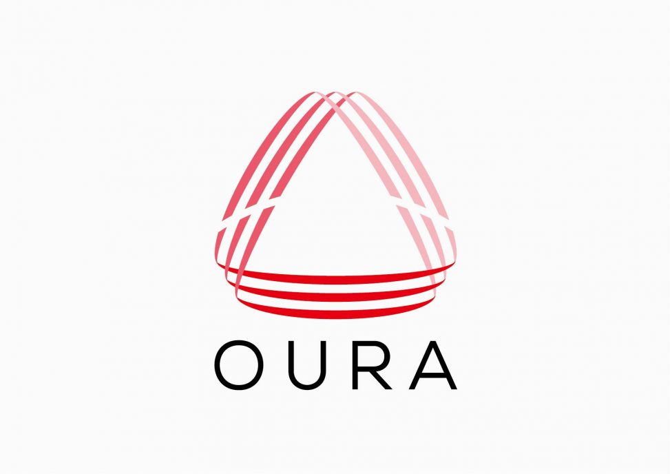
Based on the idea of ”three-way goodness”, three “lines”, three “colors”, a triangular “shape” were combined and designed a logo. The red gradation is an image of the sunset, and it combines the charm and warmth of the sunset with the idea of a company that wants to contribute widely to society.
関西・関東を中心に自習室を運営される企業の、CI整理・ロゴデザイン。「三方善し」の考えをベースに、三本の「帯」、三つの「色」、三角の「形」を組み合わせ、ロゴとして表現しました。赤のグラデーションや その中に浮かび上がる曲線のシルエットは 夕焼けをイメージし、広く社会に貢献したいという企業の考えに、夕焼けの魅力や暖かさを重ね、 思いを込めています。
<神戸のインテリアデザイン ・店舗デザイン のTHREE(スリー)>
コメントは受け付けていません。